PRD approved. Figma signed off. Engineering says Q2.
It’s November.
By the time anyone builds it, the market has moved. Stakeholders forgot why they cared. The idea dies in a backlog.
This is the Validation Gap. The space between “approved PRD” and “something users can touch.”
Rapid prototyping changes that.
TL;DR: Turn a PRD into a working web app in 60 minutes. Database, login, real data—all included. No code. No waiting for engineering. Just Mocha and your requirements doc.
What You’ll Build
In one hour, you’ll go from a text document to a live app.
The Tutorial Project: Waitlist + Admin Dashboard
You’re launching a new feature. You need a waitlist page to capture interest and an admin view to see who signed up. Engineering is busy. Marketing needs it this week.
By the end, you’ll have:
- A public signup form (name, email, company, role, use case)
- An admin dashboard with all signups in a searchable table
- Charts showing signup trends and breakdown by role
- Filters to slice the data by date, role, or company size
- 500 realistic test signups to see how it handles real volume
- A live URL you can share today
Total time: 60 minutes. Code written: zero.
Why Clickable Mockups Aren’t Enough
Let’s be honest. Here’s what “prototyping” usually means for PMs:
| What You Build | What You Learn |
|---|---|
| Figma clickable prototype | ”This layout feels right” |
| Static HTML mockup | ”The navigation makes sense” |
| Slide deck with screenshots | ”Stakeholders nodded politely” |
None of these answer the real question: Will this actually work?
A Figma prototype can’t tell you if your data model is wrong. It can’t show you that users quit at step 3 because the form is too long. It looks like software. It’s not software.
Functional Prototypes Are Different
| Clickable Mockup | Functional Prototype | |
|---|---|---|
| Data | Fake (hardcoded) | Real (database) |
| Logic | None | Real (if/then/else) |
| User Input | Simulated | Actually saves |
| Login | Fake screen | Real accounts |
| What You Learn | ”This looks good" | "This works” |
With a mockup, users say “I would use this”.
With a functional prototype, you see if they actually use it.
The 60-Minute Workflow
Here’s exactly how we’ll get from PRD to live app:
| Phase | What Happens |
|---|---|
| 1. Prep Your PRD | Structure requirements for AI |
| 2. Generate the App | Mocha builds database, UI, and logic |
| 3. Add Test Data | Generate realistic data at scale |
| 4. Refine with Prompts | Iterate on UX and functionality |
| 5. Deploy | One click to a live URL |
Let’s build.
Phase 1: Prep Your PRD for AI
AI works best with structure. The PRD format you use for engineers won’t work here. You need to be clear about data and behavior. Not just features.
The AI Friendly PRD Format:
# App Name: LaunchList
## Core Objective
A waitlist signup page with an admin dashboard to track and analyze signups.
## Data Models
1. **Signup**   - name (Text, required)   - email (Email, required, unique)   - company (Text)   - company_size (Enum: 1-10, 11-50, 51-200, 201-1000, 1000+)   - role (Enum: PM, Engineer, Designer, Founder, Marketing, Other)   - use_case (Long text) — "What would you use this for?"   - source (Enum: Twitter, LinkedIn, Google, Referral, Other)   - created_at (DateTime, auto-set)
## User Roles
- **Public:** Can submit the signup form (no login required)- **Admin:** Can view all signups, filter, search, and see analytics
## Key Views
1. **Public Signup Page:** Clean form with fields above. Success message after submit.2. **Admin Dashboard:**   - Summary stats at top (total signups, signups this week, top role)   - Line chart: signups over time (last 30 days)   - Pie chart: breakdown by role   - Table: all signups with search, sort, and filters3. **Filters:** By date range, role, company size, source
## Key Behaviors
- Duplicate emails show friendly error "You're already on the list!"- Table is sortable by any column- Clicking a row shows full details in a slide-out panel- Export to CSV button for the filtered data
## Edge Cases (Important for Engineering Handoff)
These are the things that are hard to spec in a doc but obvious in a prototype:
- **Empty state:** What does the dashboard look like with 0 signups?- **Partial data:** What if someone skips optional fields?- **Chart behavior:** Do charts update when filters change? (Yes)- **Date grouping:** Daily buckets for the line chart? Weekly? (Daily)- **"This week" definition:** Monday-Sunday or rolling 7 days? (Rolling 7)- **Search scope:** Search name, email, and company? Or just email? (All three)- **Mobile:** Does the table scroll horizontally or stack cards? (Scroll)
What makes this work:
- Clear data types (Text, Email, Enum) — not vague words like “user info”
- Enums spelled out (exact options for role, company_size, source)
- Two distinct views (public form vs admin dashboard)
- Specific behaviors (“Duplicate emails show error” beats “handle duplicates”)
Copy this format. Swap in your own idea. The structure matters more than the details.
Time Saved: Phase 1
| Traditional Approach | With AI Prototyping |
|---|---|
| Write PRD (1 week) | Write PRD (1 week) |
| Design review (3-5 days) | Format for AI (10 min) |
| Eng scoping (2-3 days) | — |
| Wait for sprint capacity | — |
| 2-3 weeks before code starts | Same day |
Phase 2: Generate the App
Open Mocha. You’ll see a text box and a paperclip icon.
Save your PRD as a markdown file and attach it using the paperclip. Text prompts are limited to 2,000 characters, but attached files aren’t—so upload the full PRD instead of pasting it.
Then add a short prompt:
The database schema should match the Data Models exactly. Include proper authentication with Admin and Public roles.
What happens next:
Mocha builds everything at once:
- Database: Signups table with all the fields from your PRD
- Backend: APIs to create, read, and query signups
- Frontend: Public signup form + admin dashboard with table and charts
- Auth: Admin login to protect the dashboard
In about 60 seconds, you’ll see a working app in the preview.
First reaction: It works. The form has all the fields. The dashboard has stats, charts, and filters. But it’s empty—you need test data to see how it handles real volume.
Phase 3: Add Test Data
An empty app looks broken. Add test data to see if it actually works at scale.
- Spread created_at dates over the last 60 days (more recent = more signups, to simulate growth)
- Mix of company sizes and roles (weight toward PM and Founder)
- About 70% should have a use_case filled in, 30% left blank
- Use realistic names, emails ([email protected]), and company names
- Include some duplicates to test the duplicate email handling
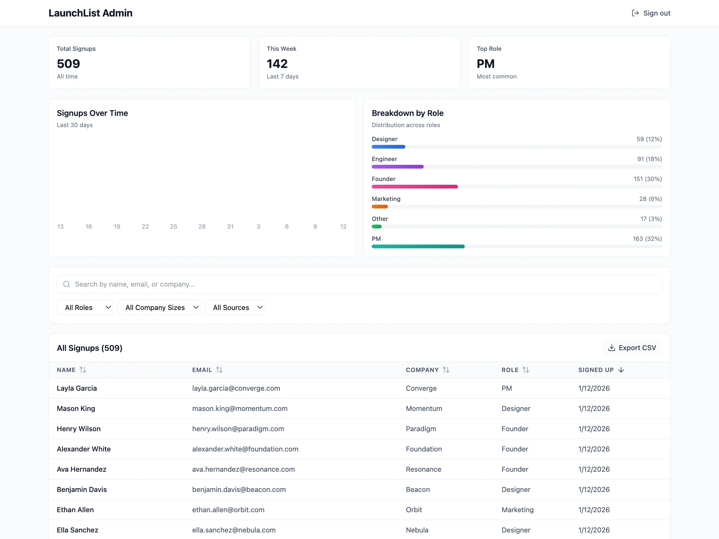
Now it feels real. 509 signups, charts showing trends, a table you can actually scroll through. Test it like a user:
- Submit the signup form — does it save? Does the confirmation message appear?
- Try a duplicate email — does it show “You’re already on the list!”?
- Check the dashboard charts — do they reflect the 500 signups correctly?
- Filter and search — does the table respond quickly with 500 rows?
- Check mobile — does the table scroll horizontally?
With real data, you’ll spot issues that are invisible in an empty app. Now you can refine with confidence.
Phase 4: Refine with Prompts
This is vibe coding. You describe what you want changed. Mocha updates the app. No code involved.
Prompt 1: Improve the Signup Experience
- Add a subtle "Join 500+ others on the waitlist" line above the form for social proof
- After signup, show their waitlist position: "You're #512 on the list!"
- Add a "Share to move up" button that copies a referral link to clipboard
- The confirmation should feel celebratory, not just functional
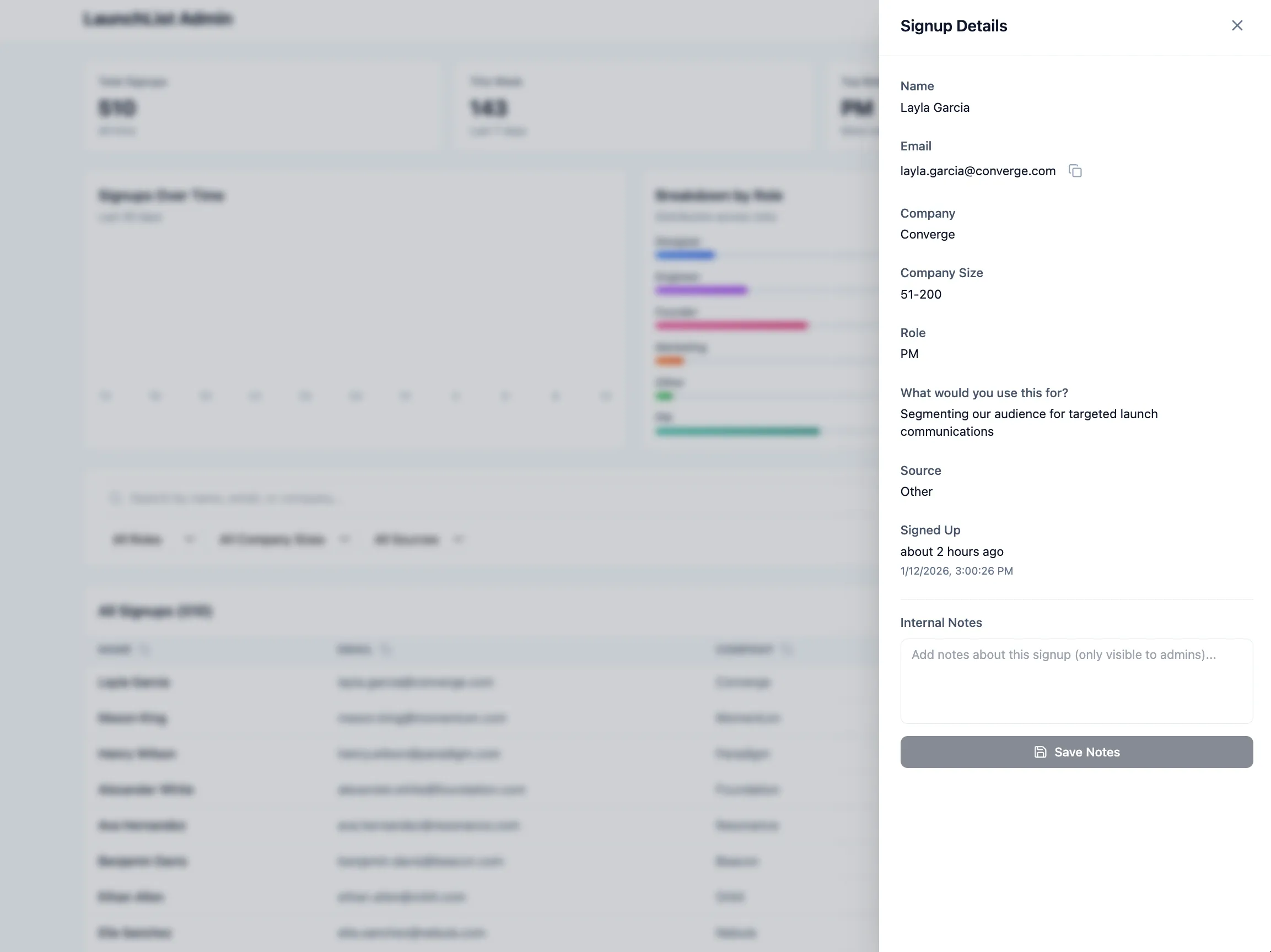
Prompt 2: Add a Detail View (Admin)
- All fields including the complete use_case text
- When they signed up (relative time like "3 days ago")
- A "Copy email" button
- Option to add internal notes about this signup
Prompt 3: Add Date Range Filtering (Admin)
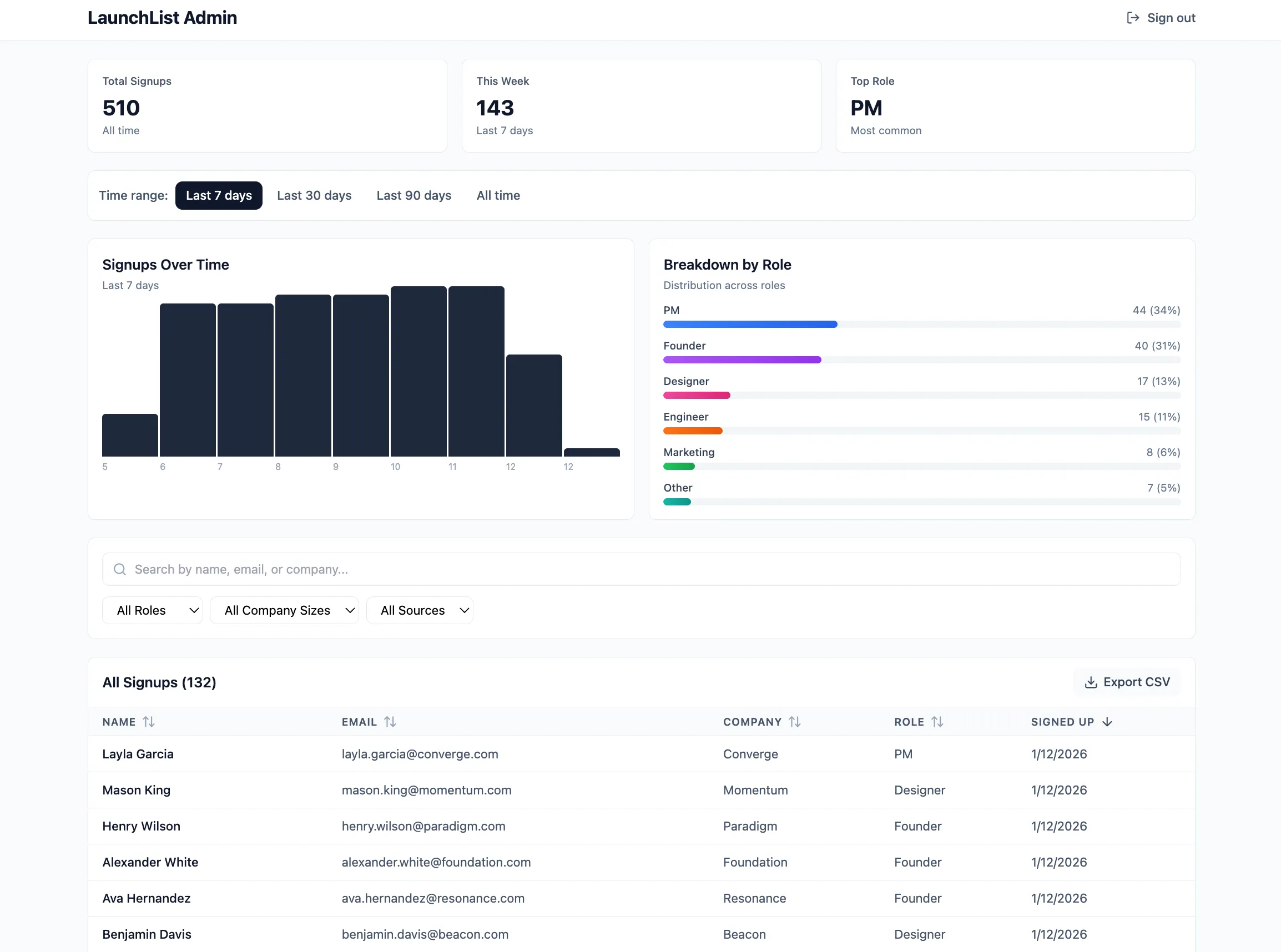
The key: Be specific. Say what and where. “Make it look better” fails. “Add a slide-out panel when I click a row” works.
More tips: guide to getting results with AI builders.
Time Saved: Phase 4
| Traditional Approach | With AI Prototyping |
|---|---|
| File Jira ticket for UI changes | Describe what you want |
| Wait for designer availability | See changes in 30 seconds |
| Design review | Iterate immediately |
| Wait for eng to implement | — |
| QA cycle | — |
| Total: 1-2 sprints (2-4 weeks) | Total: 15 minutes |
This is the point. Find and fix bugs before engineering spends weeks building the wrong thing.
Phase 5: Deploy
You’ve built something that works. Now make it real.
- Click the “Publish” button in the top right
- Wait about 30 seconds
That’s it. You get a live URL on mocha.app that you can share immediately.
Email to stakeholders:
“Marketing wants a waitlist page for the new feature launch. Here’s a working prototype with signup form, admin dashboard, and analytics. Try it: [LINK]. Does this cover what you need?”
The prototype is the spec now.
The PRD Template (Copy This)
Here’s a clean template you can adapt for any app:
# App Name: [Your App Name]
## Core Objective
[One sentence: What does this app do and for whom?]
## Data Models
### [Model 1 Name]
- Field_Name (Type: Text/Email/Number/Date/Enum/Reference, required/optional)- Field_Name (Type, constraints)
### [Model 2 Name]
- Field_Name (Type)- Linked*To*[Model1]\_ID (Reference to Model 1)
## User Roles
- **[Role 1]:** [What they can do]- **[Role 2]:** [What they can do]
## Key Views
1. **[View Name]:** [Description of what user sees]2. **[View Name]:** [Description]
## Key Behaviors
- [When X happens, Y should occur]- [Specific interaction → specific result]
## Style Notes (Optional)
- [Design preferences: "minimal like Linear" or "friendly like Notion"]- [Color preferences if any]
The more specific you are about data types and behaviors, the better the first generation will be.
When to Use This
This is the real unlock. The 60-minute workflow above is useful. But knowing when to use it changes how you work as a PM.
Not every idea needs a prototype. Here’s when it helps most.
1. Internal Tools That Engineering Will Never Build
Every company has a list of internal tools that would make life easier. Sales wants a commission tracker. HR needs an onboarding checklist. Customer success wants a renewal dashboard.
Engineering will never prioritize these. The ROI math doesn’t work for a 6-week sprint. But it does work for 2 hours of a PM’s time.
Real examples:
- Commission calculator: Sales reps enter deal size, see their commission instantly. Saves 50 Slack messages a month.
- Interview feedback form: Interviewers submit structured notes. Hiring manager sees all feedback in one place. No more hunting through email.
- Release notes generator: PM enters feature name and bullet points. Tool formats it for Slack, email, and docs. One input, three outputs.
- Team directory: Who’s on which team? What’s their Slack handle? Photo, role, timezone. Better than a spreadsheet.
These tools aren’t products. They’re utilities. Build them in an afternoon. Iterate when people complain. Move on. (Need inspiration? Here’s a custom CRM tutorial you can adapt.)
2. Test Ideas Before Committing Engineering
The most expensive mistake in product development: building the wrong thing.
Traditional approach: Write PRD → Design → Build → Launch → Discover nobody wants it.
Prototype approach: Write PRD → Build MVP in an hour → Put it in front of users → Decide if it’s worth building for real.
The prototype is a 50K bet. Make the small bet first.
When this works best:
- New feature exploration: “Should we add a marketplace to our SaaS?” Build a quick version. See if users list anything. If engagement is zero after two weeks, you saved a quarter of engineering.
- Pricing experiments: “Will users pay for this?” Build a version with a fake paywall. See how many people click “Upgrade.” Real signal, no code.
- UX validation: “Is this workflow too complicated?” Build it. Watch users stumble. Fix the confusing parts. Then spec the real version.
This isn’t fake validation. It’s real software. Users can actually do the thing. Their behavior tells you what surveys and interviews never will.
3. Better Engineering Handoffs
Engineers misread PRDs. Not because they’re careless. Because words are ambiguous.
“The dashboard should show user activity” means different things to different people. Which activity? How displayed? What timeframe?
A PRD describes intent. A prototype shows execution.
What engineers get from a prototype that PRDs can’t give:
| PRD says… | Prototype shows… |
|---|---|
| ”Display user activity” | Exactly which events, in which order, with which grouping |
| ”Mobile-responsive” | Whether the table scrolls or stacks |
| ”Handle edge cases” | What the empty state actually looks like |
| ”Clean, modern design” | The exact colors, spacing, and typography |
| ”Filter by date” | Whether it’s a dropdown, date picker, or preset buttons |
Engineers can click through your prototype. Test edge cases. See how things should work. Fewer questions. Fewer misunderstandings. Faster builds.
The prototype becomes the spec.
4. End Stakeholder Debates Instantly
You know the meeting. The one where everyone has opinions about a feature nobody’s seen.
“But what about mobile users?” “What if someone enters invalid data?” “This will confuse people in EMEA.”
These conversations spiral because everyone’s imagining something different.
A working demo ends it.
“What about mobile?” → Share your phone. Let them tap around. “Invalid data?” → Type gibberish into the form. Watch it validate. “EMEA confusion?” → Send them the URL. Get feedback from actual EMEA users.
Opinions lose to evidence. Demos create evidence.
5. Customer and Sales Demos
Your sales team is pitching a feature that doesn’t exist yet. Your roadmap deck has screenshots of mockups. The prospect asks: “Can I try it?”
Awkward silence.
Or: you build a prototype. It works. They click around. They see their use case in your product. Deal closed.
Use cases:
- Enterprise sales: “We’re building multi-tenant support. Here’s what your admin console would look like.” Prospect can actually click around.
- Customer discovery: “We’re thinking about adding X. Here—try it. What’s missing?” Real feedback on real software.
- Board updates: Instead of slides showing what you might build, show a working demo of what you could ship.
Prototypes make the future tangible.
6. Budget Justification
Getting budget for a new initiative? Slides don’t work as well as demos.
“We want to build a customer portal” → Eyes glaze over.
“Here’s a working customer portal. I built it in 4 hours. Imagine what engineering could do with a full quarter.” → Budget approved.
The prototype proves two things: (1) the idea is real, and (2) you’ve thought it through. Both matter when asking for resources.
Quick Reference: When to Prototype
| Situation | Prototype? | Why |
|---|---|---|
| Internal tool for 10 people | ✅ Yes | Faster to build than to request |
| Testing if users want a new feature | ✅ Yes | Cheaper than building the wrong thing |
| Handing off to engineering | ✅ Yes | Reduces ambiguity, speeds development |
| Settling a design debate | ✅ Yes | Evidence beats opinions |
| Enterprise sales demo | ✅ Yes | Closes deals that mockups can’t |
| Mission-critical infrastructure | ❌ No | Needs production-grade engineering |
| Compliance-heavy feature | ❌ No | Legal review required anyway |
| Already have clear requirements | Maybe | Still useful for demos; skip if time is tight |
Common Mistakes
Mistake 1: Vague PRDs
❌ “The app should have user management”
✅ “Users table: email (unique), name, role (admin or member). Admins can invite users. Members can only edit their own profile.”
Mistake 2: Building too much
Your first prototype shouldn’t have every feature. Build the core flow. The one thing you need to test. Add more later.
Mistake 3: Skipping the data model
AI can guess your data structure. It often guesses wrong. Spend 5 minutes defining your models. Save 30 minutes of fixes later.
Mistake 4: Not enough test data
An app with 3 records looks fine. An app with 500 records shows real problems. Pagination issues. Slow loading. Bad UX. Generate enough data to stress-test.
What’s Next: 3 Quick Upgrades
Your prototype is live. Here are three ways to make it better—no external integrations required.
1. Priority Scoring
Not all signups are equal. Auto-rank them by fit:
- Company size: 1000+ = 30 points, 201-1000 = 25, 51-200 = 20, 11-50 = 15, 1-10 = 10
- Role: Founder = 30 points, PM = 25, Engineer = 20, others = 15
- Has use_case filled in = 20 points, empty = 0
Show the score in the table. Add a "Sort by priority" option. Highlight high-priority signups (80+) with a badge.
2. Referral Tracking
Turn signups into a growth channel:
- Each signup gets a unique referral link (like launchlist.mocha.app?ref=abc123)
- When someone signs up via a referral link, record who referred them
- Add a "Referrals" column to the admin table showing how many people each signup referred
- Add a simple leaderboard showing top 10 referrers
3. Launch Waves
Stage your rollout instead of inviting everyone at once:
- New field on Signup: wave (Enum: Unassigned, Wave 1, Wave 2, Wave 3, Invited)
- Bulk action: select multiple signups and assign them to a wave
- Filter the table by wave
- Show wave counts in the summary stats (e.g., "Wave 1: 50 signups, Wave 2: 120 signups")
- "Mark as Invited" bulk action that updates status and could trigger an email later
Each would take engineering days to spec and build. You can test the UX in minutes.
Frequently Asked Questions
What is rapid prototyping for product managers?
Building working apps fast—in hours, not weeks. Not mockups. Real apps that users can test. Using AI tools that don’t require coding.
How do I turn a PRD into a working prototype?
Write a PRD with clear data models, user roles, and behaviors. Paste it into Mocha. The AI builds the database, backend, and frontend at once. Refine with prompts. Deploy with one click.
How long does it take?
Under 60 minutes with AI tools. Traditional approaches take 4-8 weeks.
What’s the difference between a mockup and a functional prototype?
A mockup shows what an app could look like. No real functionality. A functional prototype actually works. Data saves. Login works. Users can do real things with it.
Can product managers build apps without coding?
Yes. Tools like Mocha let you describe what you want in plain language. Database, login, hosting—all handled automatically. No coding needed.
What should a PRD include for AI prototyping?
Five things: (1) data models with field types, (2) user roles and permissions, (3) key screens, (4) specific behaviors (“when X happens, Y occurs”), and (5) style notes. Be specific. Avoid vague phrases like “user management.”
When should PMs use rapid prototyping?
Use it for: validating ideas, building internal tools, creating demos, testing assumptions. Wait for engineering when: you need production scale, complex integrations, or strict compliance requirements.
Is “vibe coding” hard to learn?
No. The term was coined by Andrej Karpathy to describe building software by describing what you want. If you can write a Jira ticket, you can vibe code. Be specific about what and where. That’s it.
Can I hand off a Mocha prototype to engineering?
Yes. Mocha generates real code (React/TypeScript). Engineers can export it and extend it. Or you can keep building in Mocha for production.
What’s the difference between Mocha and Figma?
Figma creates visual mockups—great for testing layouts and getting design feedback. But Figma prototypes don’t have real functionality. Mocha creates working apps with databases and login. Use Figma to test how it looks. Use Mocha to test if it works. (See our full comparison of AI app builders for more.)
The Bottom Line
The hard part of product development has always been turning ideas into code. That used to take engineers, sprints, and weeks of waiting.
Not anymore.
Go from PRD to working software in an hour. Real software. Not slides. Not mockups. Something users can actually test.
This doesn’t replace engineering. It accelerates it. When you hand off to the dev team, you’re giving them a working example. Not a doc full of guesses. Fewer misunderstandings. Faster progress.
Stop waiting for the sprint. Start building.
Try It
- Pick one idea you’ve been waiting to test
- Write the PRD using the format above
- Build it in Mocha — start free
- Share it with a stakeholder today
The best way to get buy-in? Show it working.